
In this article, I want to show a few tricks to help you with the storing and calculating of marks and grades. Then, I want to show you the exciting stuff – how with a few simple processes you can visualise the marks book in a way that helps you see meaning and an individual story for each and every student.
 As I write this we are starting term 2, having just finished the intense assessment period that schools seem to go through just before the start of any “holiday”. As usual, this means marks books are getting filled, comments crafted and reports written. A lot of teachers use Microsoft Excel to store the marks and grades for their students – as such, I am going to assume that you:
- Understand the letter based co-ordinate system for excel (Letters for columns, numbers for rows, so you end up with a letter:number co-ordinate such as G12)
- Know how enter data into Excel
- Know how to format a cell with a background and/or border, font size, column height, column width, text alignment/wrap and so on
If you don’t, I suggest you have a look at the inbuilt Excel help or an Excel training materials at Microsoft Office support: https://support.office.com/en-au/article/Excel-2013-training-courses-videos-and-tutorials-aaae974d-3f47-41d9-895e-97a71c2e8a4a?ui=en-US&rs=en-AU&ad=AU
Formula
Once we have our raw data into a spreadsheet, there are some really simple formula we can use to help us know a bit more about our data set. In Excel, to enter a formula you start with the equals sign “=” and then write the syntax of the formula that you need. The important formula that help us create summary information about a class are:
| Name | Description | Formula | Example |
| Count | “Counts” how many values there are in a range of cells | =COUNT(cell_range) | =COUNT(E6:E27) |
| Average | Returns the mean value from a range of cells | =AVERAGE(cell_range) | =AVERAGE(E6:E27) |
| Standard Deviation (St Dev) | Returns the standard deviation from a range of cells | =STDEV(cell_range) | =STDEV(E6:E27) |
| Median | Returns the median value from a range of cells | =MEDIAN(cell_range) | =MEDIAN(E6:E27) |
| Rank | Returns the position in the rank order of a cell value from within a range | =RANK(cell,cell_range) | =RANK(E30,$E$30:$L$30) |
Note: the “$” symbol in a cell range forces the cell range reference to stay the same when copied to other cells – it means that a dynamic formula can be dragged through a cell range, but the cell range reference stay the same.
If each of these are used for an assessment item or criteria, important information about a class can be understood. Here is an example worksheet that is produced using a combination of these formula. You can also download the full Excel workbook at the end of this article – this is the “Markbook” tab.
 You can see here that there have been two assessments – an assignment with three criteria, and an exam with five criteria. Each criteria is graded on a 1-15 scale (A+ to E-). By converting these letters to numbers, the mathematics that the formulas use in Excel work! The students are ordered in student number order, and at the bottom, you can see the summary information. The Standard Deviation gives a sense of the spread of values within the class, whilst the average gives an indication of how hard each criteria is – the higher the value, the easier the criteria was for the class – and this was used to determine the difficulty rank in the third row. There is also overall and criteria summary grades to the right, and these are calculated by multiplying each criteria result by the weighting to get a total weighted score, and then converting this back to a 1-15 scale.
Many of us have mark or grade books that look like this – but with a little extra work using some neat tools in Excel, we can make them really show the story hiding in the numbers.
Guttman Pattern (or progression)
Before we expose the story within the spreadsheet, I need to explain an idea put forward by Louis Guttman, who did a lot of work on testing and test results. He found that if you determined the difficulty of each question in a test, and then ordered the students responses from highest performing to lowest performing, and the questions from easiest to hardest, a typical triangle pattern emerged. It is along the edge of the triangle that we see the zone of proximal development for each student – the point at which the questions become too hard and intervention (learning and teaching!) is needed.
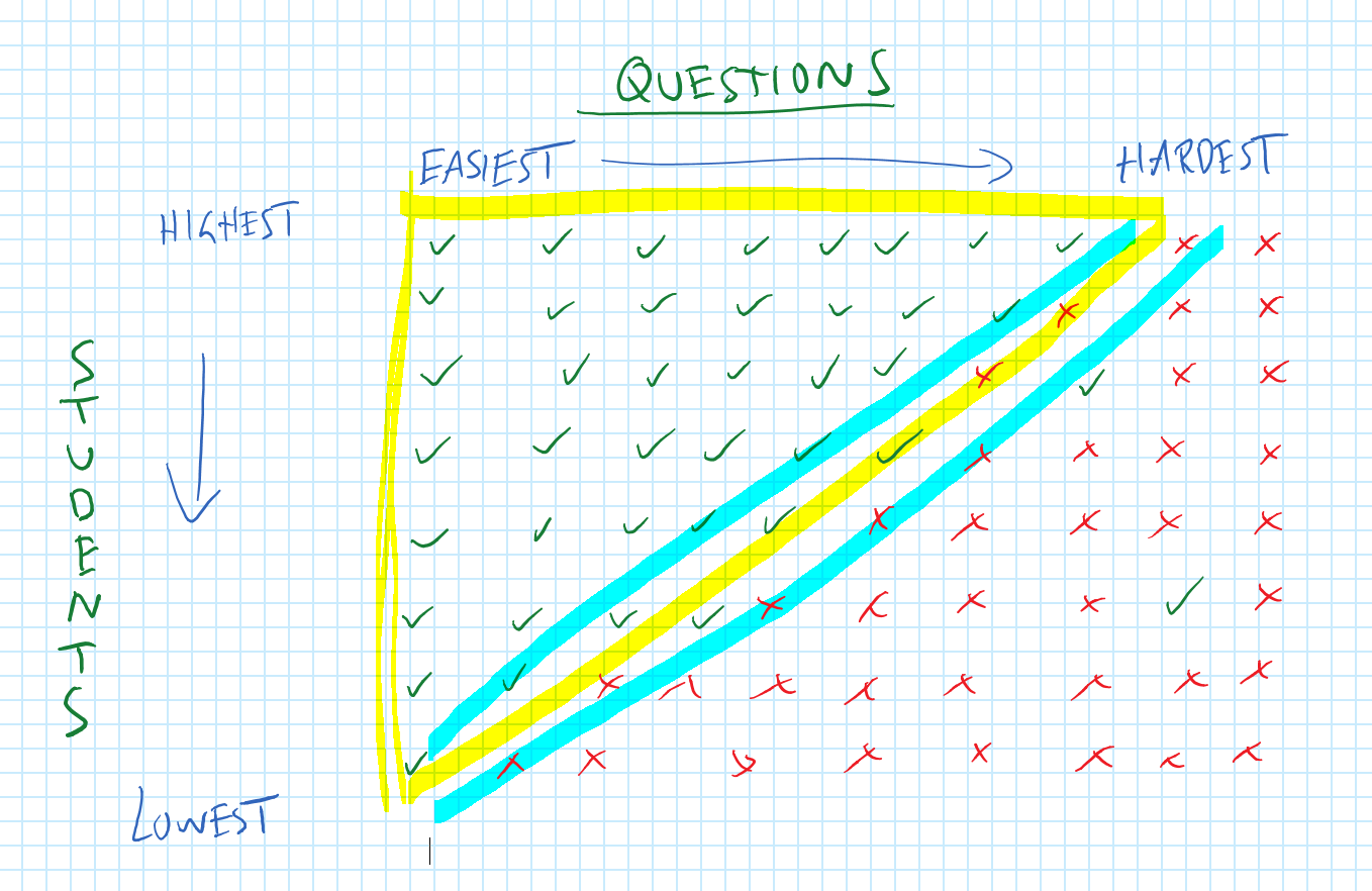
Whilst the focus that Guttman made is on a test, it is my belief that the same approach can be used on a mark or grade book of aggregated data. The approach I am suggesting is very simplistic, and doesn’t use any of the psychometric principles or mathematics (which are really neat BTW) that are used when doing this for a test, but the story that emerges is quite interesting.
Guttman pattern in Microsoft Excel
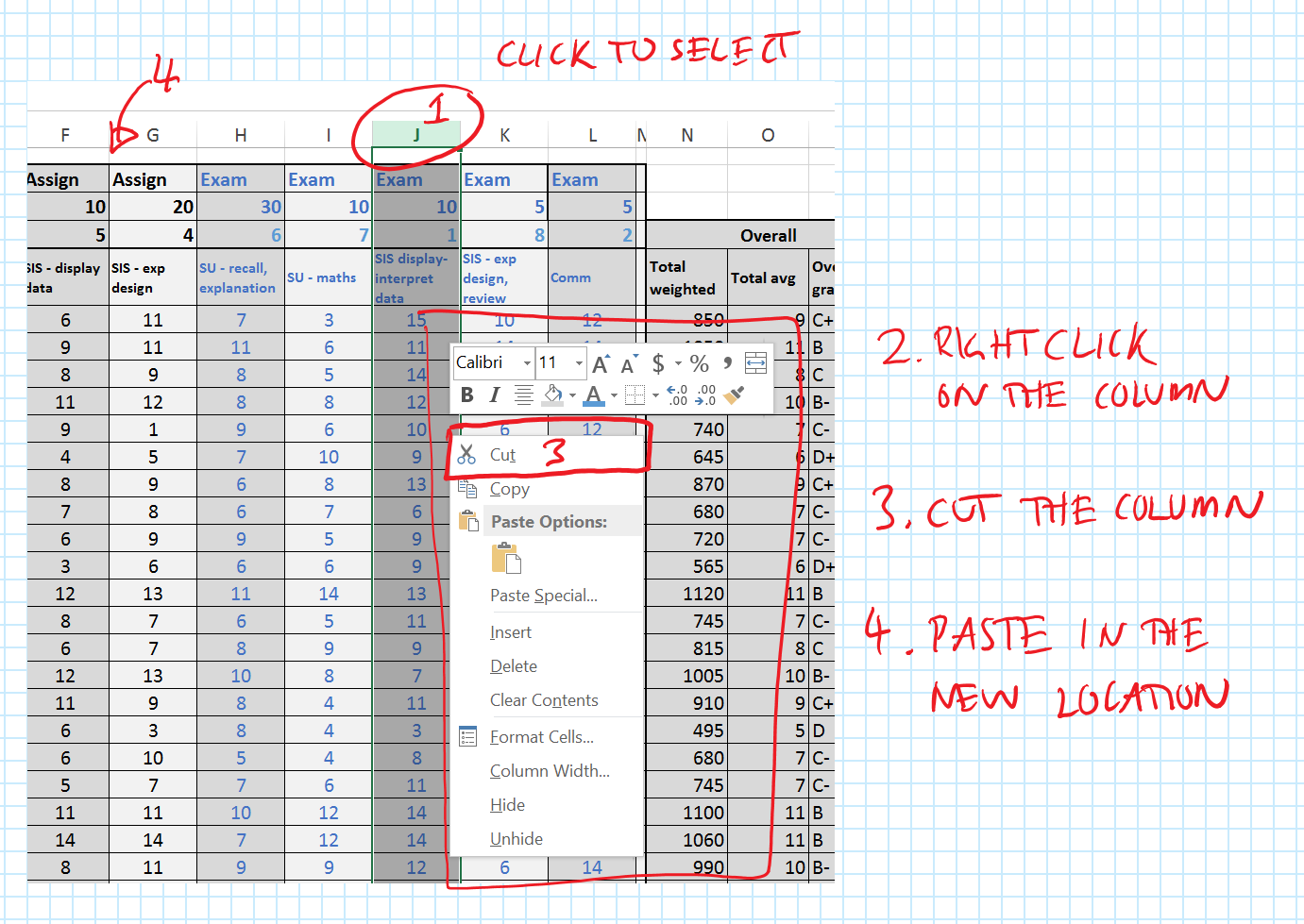
Making a Guttman pattern from our marks book is really quite simple. The first step is to reorder the criteria columns so they go from easiest to hardest – this is done by selecting the whole column ad moving it, using the “Difficulty” rank based on the class average.
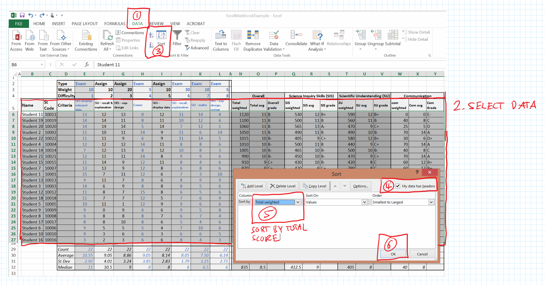
Once this is done. The students need to be ordered from highest to lowest overall mark, simply by selecting all the data and using the sort command.
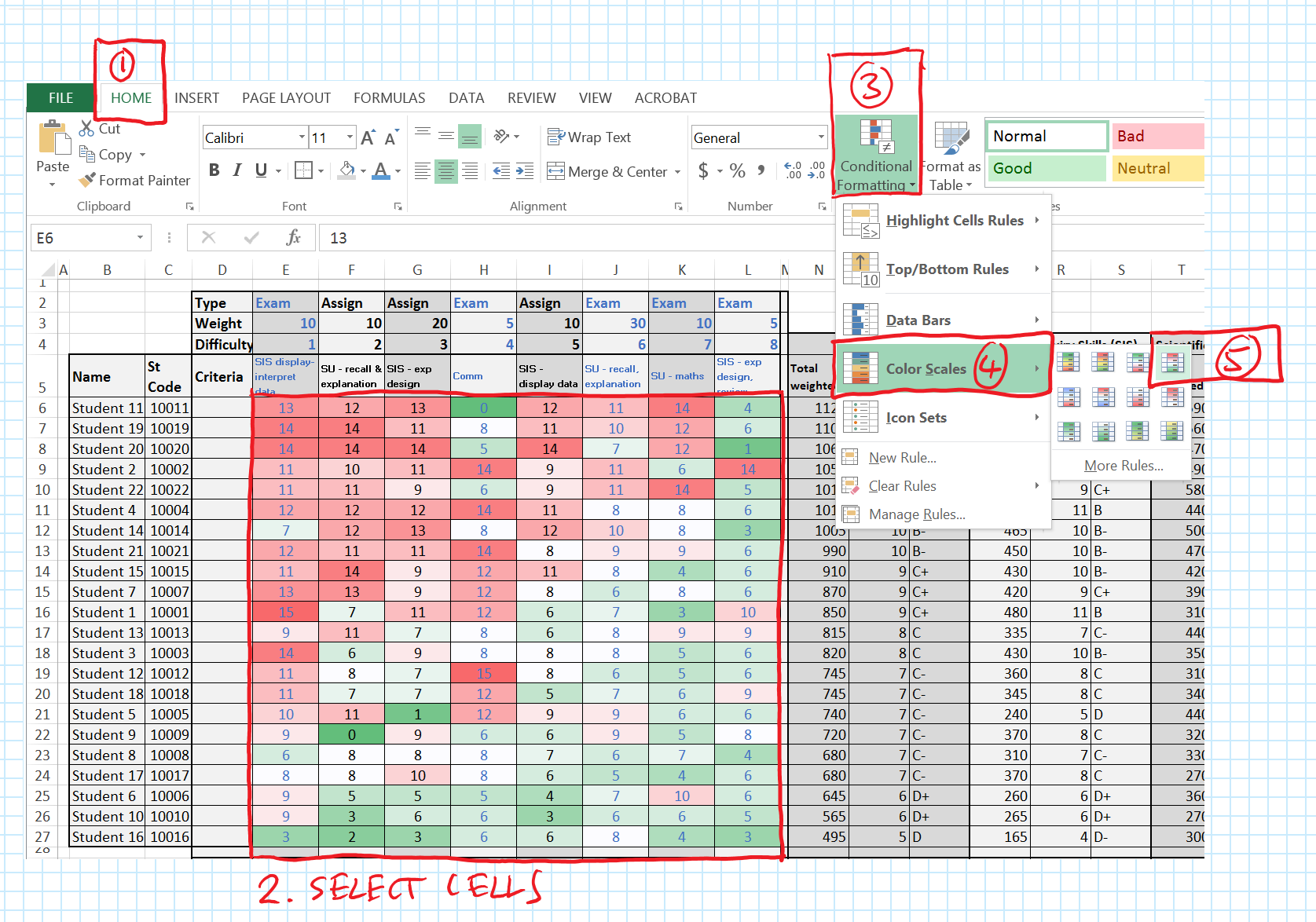
Finally, some colour coding the cells using conditional formatting allows the patterns to really come out. I have used a gradient of dark red to light red for low scores, white for the middle values, and light green to dark green for higher scores. This really brings the data to life in a visual way.
Now whilst this approach is technically not following the true psychometric principles for creating a Guttman chart, nor is it using the Guttman chart as designed (for a single test) – in my opinion, it paints (quite literally) an really interesting picture and allows the data to “speak” to us, prompting questions, further investigations and discussion.
In the example above the zone of proximal development for the class across the criteria becomes very obvious. This can be used by the teacher in planning and delivering the teaching and learning program. Additionally, there is an individual story for each of the students; consider the top three students (11, 19 and 20), who obviously have a scientific communication weakness or gap that needs filling. Or the fourth student (student 2) who really excelled at the hardest criteria for the class, but needs to work on their approach to science mathematics. Or student 14 who has a distinct weakness in the easiest item for the class, around displaying data. Each student has their own individual story, strengths and weaknesses that visually become evident.
I really encourage you to have a look at what Excel can do for you, and how you can unlock the story sitting within your mark books. When we do this, for each individual student, specific patterns and priorities emerge – and this allows for focused discussion and intervention with each of them. And after all, isn’t developing and educating students what we are all about as teachers, and shouldn’t technology make this easier?
Here is the Excel file that has the marks book and Guttman patterned marksbook in it for you to download: ExcelMarkbookExample

Thanks so much for this article. I’ll do my best to “master” this kind of sheets to be more efficient !
LikeLiked by 1 person